Lexi’s
Rebranding a snack with irreverent humour and bold indulgence.
Background
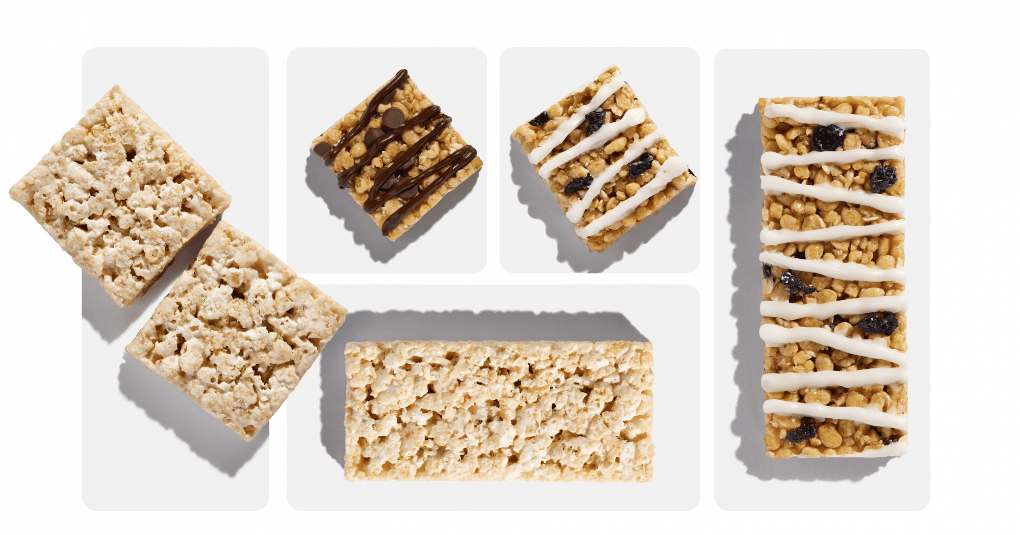
Lexi’s is a challenger brand in the free-from snacking space. It was named after its founder who sold the brand to the Serious Sweets Company. The product range is a selection of light puffed rice bars with a plethora of dietary claims, including gluten-free, nut-free, kosher, low-cal, vegetarian with a vegan protein version. The Lexi’s team approached Boldspace to grow the brand with a clear space and positioning on the shelf.
How we got there
We created a fresh brand positioning which moved beyond the functional claims to a brand with a broader lifestyle angle. Given their core competitor was speaking to a family audience, and the protein sector to ardent gym-goers, we wanted to capture the broad soft-exercise audience who wanted a gentle lift throughout the day. Our positioning of ‘Excuses’ allowed us to enter a more grown-up space and talk with irreverent humour.
Defining our positioning
As the product is a light indulgence, our ‘excuse’ was not an excuse to be lazy, but rather ‘to give people an excuse to do what they really love’ – our core brand purpose. We recommended Lexi’s Excuses as both the new positioning and the new product name. Our rallying cry of ‘you deserve an excuse’ is encouraging the consumer to both try our product and take an excuse in life; to reject the mundane whatever that looks like for you.


Visual identity
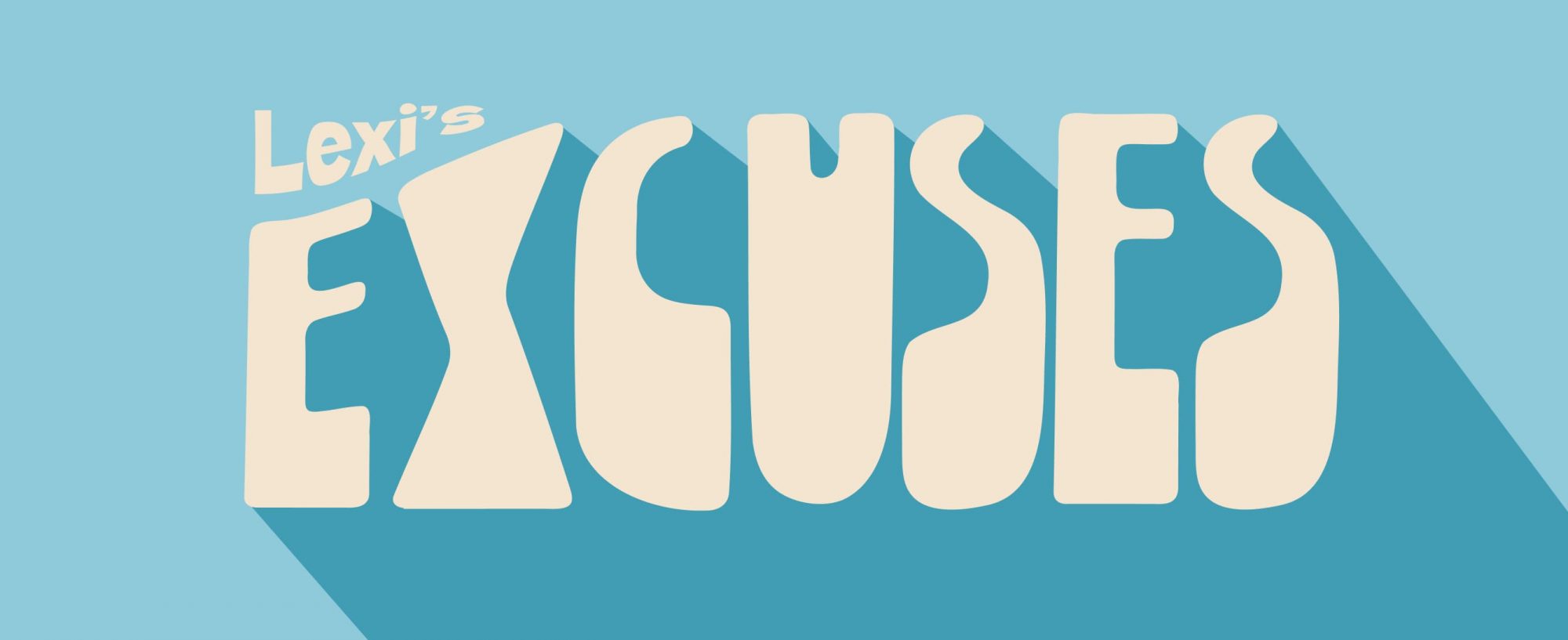
The new Lexi’s visual identity needed to represent the brand’s philosophy and showcase a lighter product with a lifestyle element. The new logomark and design system stem from the idea of following a path of adventure, with the different logo shapes elongated and stretched to suggest Excuses are always the start of a journey. We paired this with a colour palette that felt nostalgic, 1960’s browns and oranges that, when combined with the logo mark, felt both classic and at home with modern Gen-Z free-from brands.


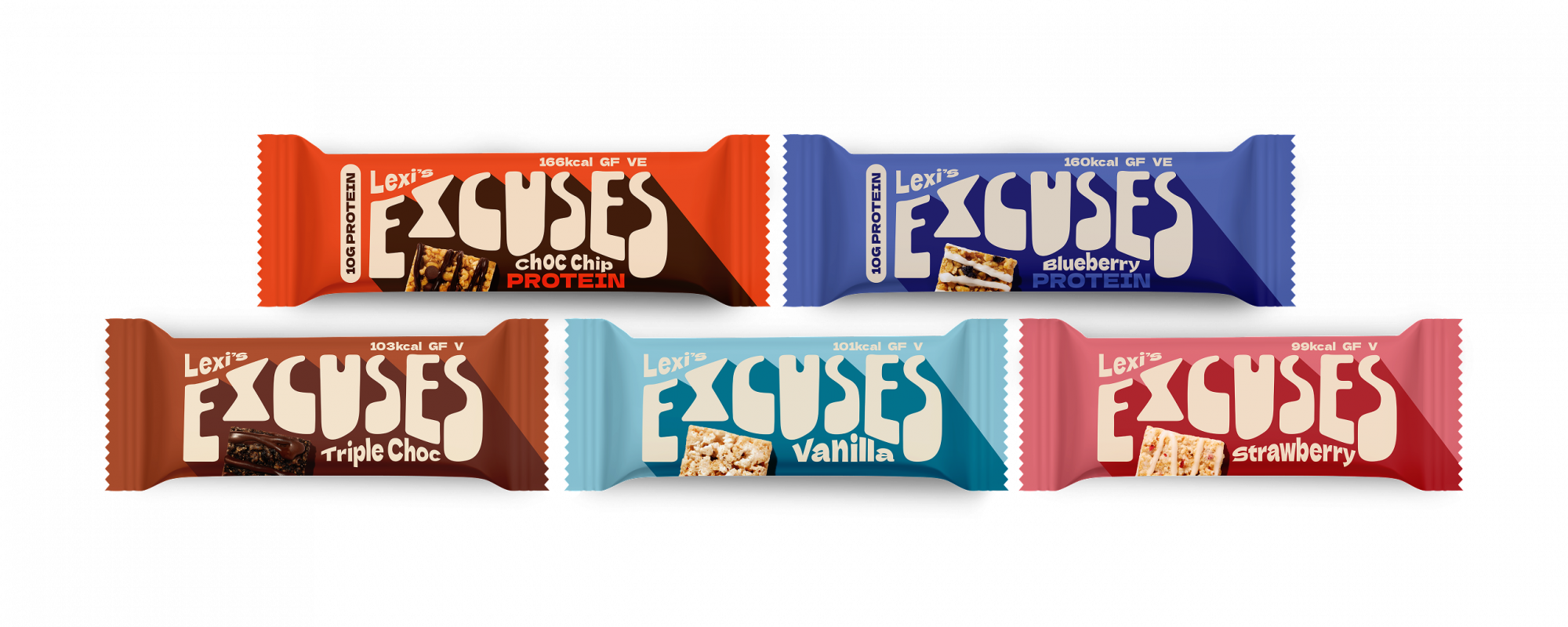
Packaging
We refreshed all packaging to align with the new positioning. Purposefully minimal copy allowed the brand name and the key product claims to stand out. And where there was room to tell more of a story, we incorporated different creative elements of the brand, such as the SRP which showcases a long list of creative excuses.