Bruumi
Reimagining motor finance to put drivers and dealers back in the front seat.
Background
First Auto Finance, a new British finance house, approached us to build a brand capable of shaking up motor finance, a category that can feel complicated, slow-moving and difficult to navigate, with most providers looking and sounding much the same.
Our task was to give the new lender the strategy, name and identity it needed to stand out, earn trust and connect with both drivers and dealers. That meant making its fairer, smarter and more human approach clear from the outset, while building in enough energy, confidence and personality to move beyond the conventions of the space.

A new name for a new era of motor finance
The original name was clear and practical, but it risked disappearing into a market full of descriptive, conventional finance brands. To introduce a genuinely fresh alternative, we needed to break away from the usual category cues and create something more distinctive, memorable and full of movement.
Bruumi was born
Bruumi blends the familiar “vroom, vroom” sound of a car engine with a nod to the business’s Birmingham roots. It brings something fresh to the industry while staying firmly automotive, and celebrates the Brummies behind the business, building a better kind of motor finance.
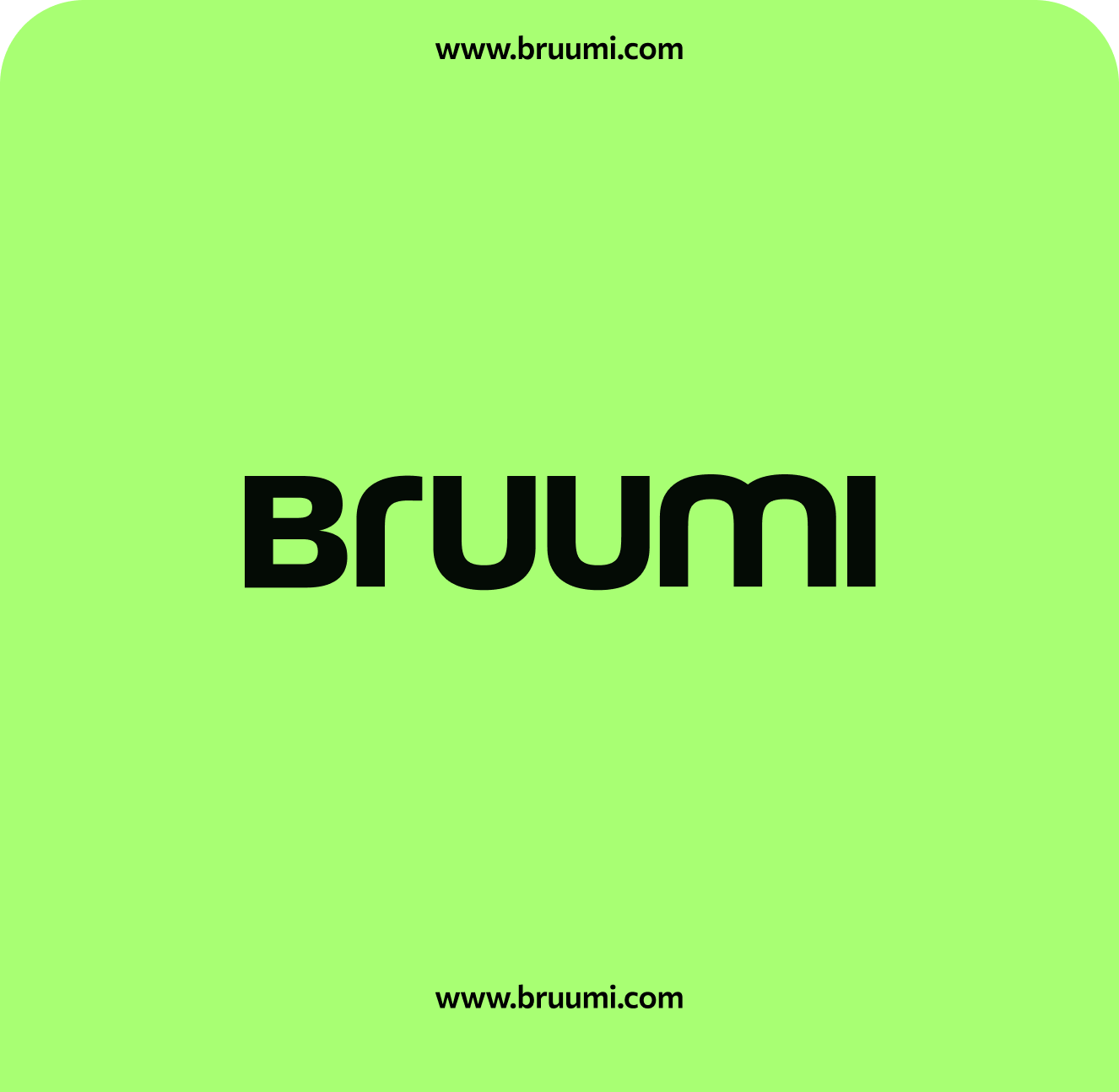
The double “u” added another layer to the idea, putting “you” at the heart of the brand, whether that’s the driver looking for their next car or the dealer working to keep business moving. Its distinctive shape then became a recognisable visual device, running through the logo, rounded frames, motion crops and wider graphic system.
How we got there
Motor finance has conditioned people to accept a bad experience - confusing terms, hidden decisions, endless waiting and almost no control. Most players either focus on the mechanics of getting a deal done or promise to make the same process feel slightly easier. But the fundamental problem remains: customers and dealers are still expected to fit around the finance process, rather than the process being built around them.
For drivers, finance is rarely the thing they care about. They want a car that gives them freedom, identity and a space that feels like their own. Yet the process too often replaces excitement with anxiety and leaves them feeling on edge.
For dealers, the same inefficiency has a hard commercial cost, slowing approvals, stalling sales and leaving stock sitting on the forecourt.
So we needed to do more than simplify the category. We needed to un-brake motor finance by challenging what everyone else had normalised, securing the sanctuary for drivers and helping dealers keep the deals turning. The opportunity was to put finance back in service of the journey, rather than in the way of it.

Brand Positioning
All of that strategic thinking came together in a big brand idea: Ignite the Drive.
There is the physical drive: getting the motor moving and putting the keys in someone’s hand. The personal drive: helping people reach a milestone, unlock a new chapter or create a space that feels truly their own. And the commercial drive: helping dealers approve customers faster, close sales and keep stock and revenue moving.
And Ignite is the spark behind it all: the moment possibility becomes progress. It captures Bruumi’s role in removing the friction that holds people and businesses back
Less handbrake, more fuel for the journey ahead. For drivers, for dealers and for every journey waiting to begin.
Visual identity
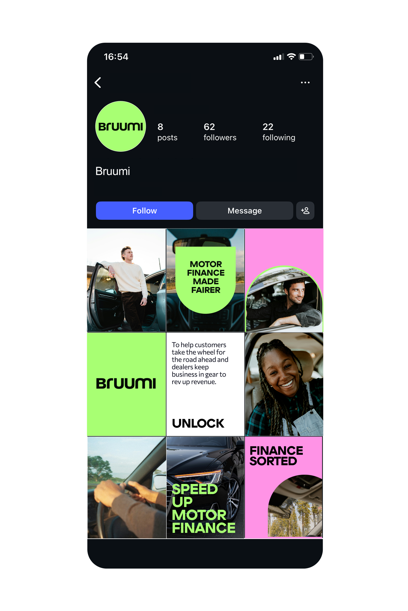
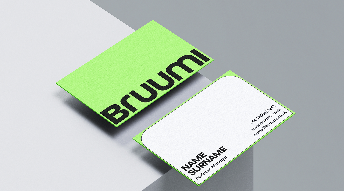
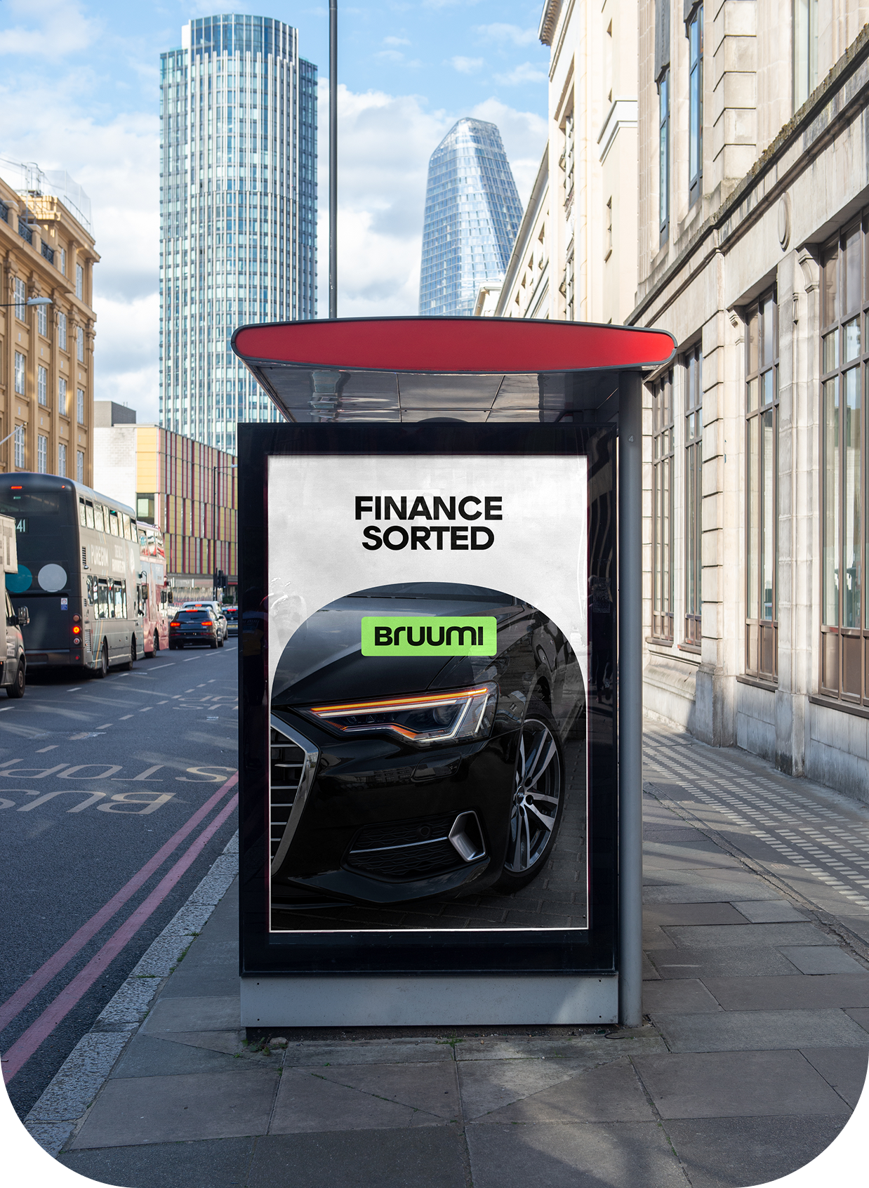
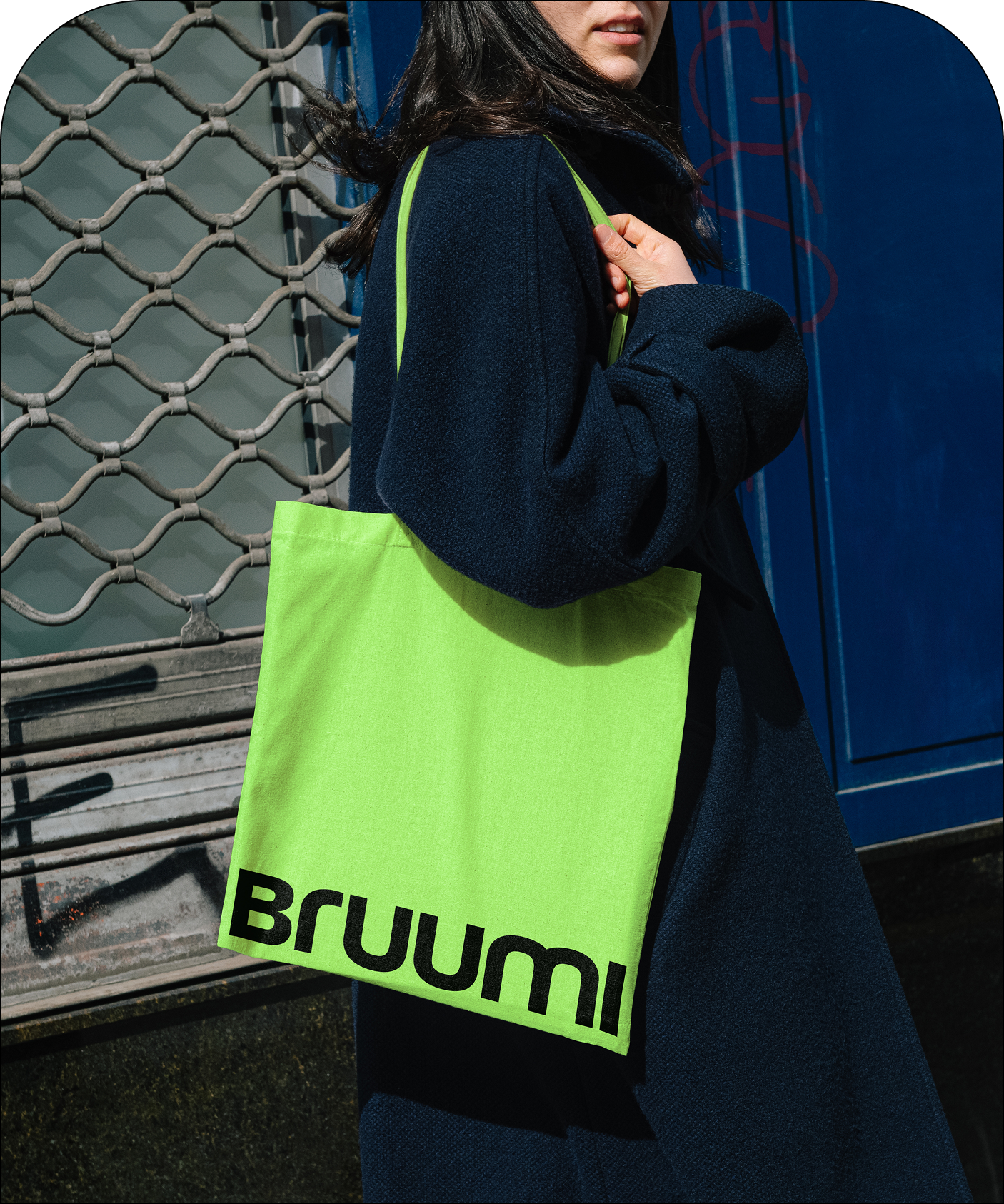
We created a visual identity that feels bold, energetic and deliberately at odds with traditional finance, designed to challenge the category rather than conform to it. The wordmark takes its cues from the road, with smooth curves that suggest movement and acceleration. At its centre is the U, the mother shape that gives rise to the other letterforms and the wider visual system.
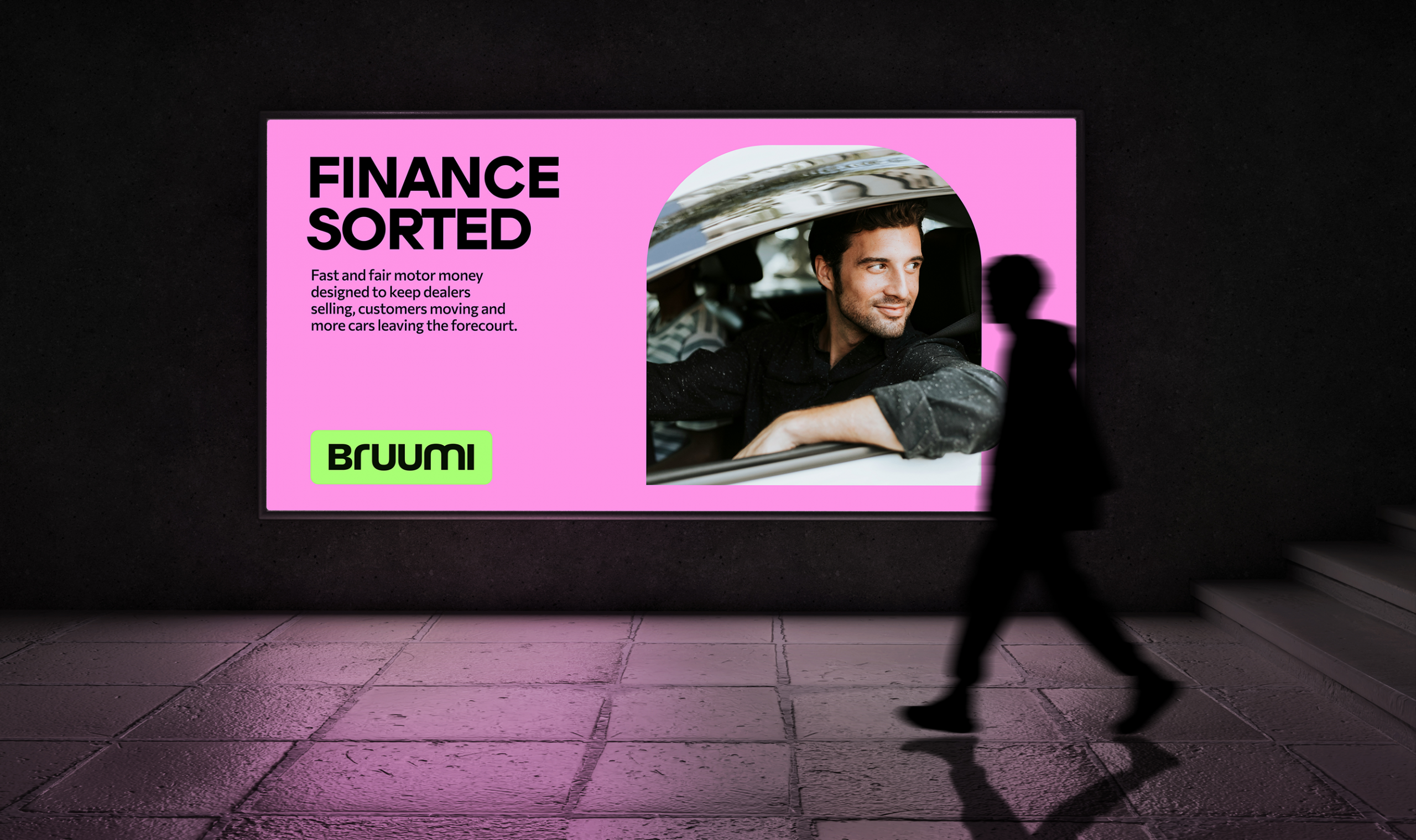
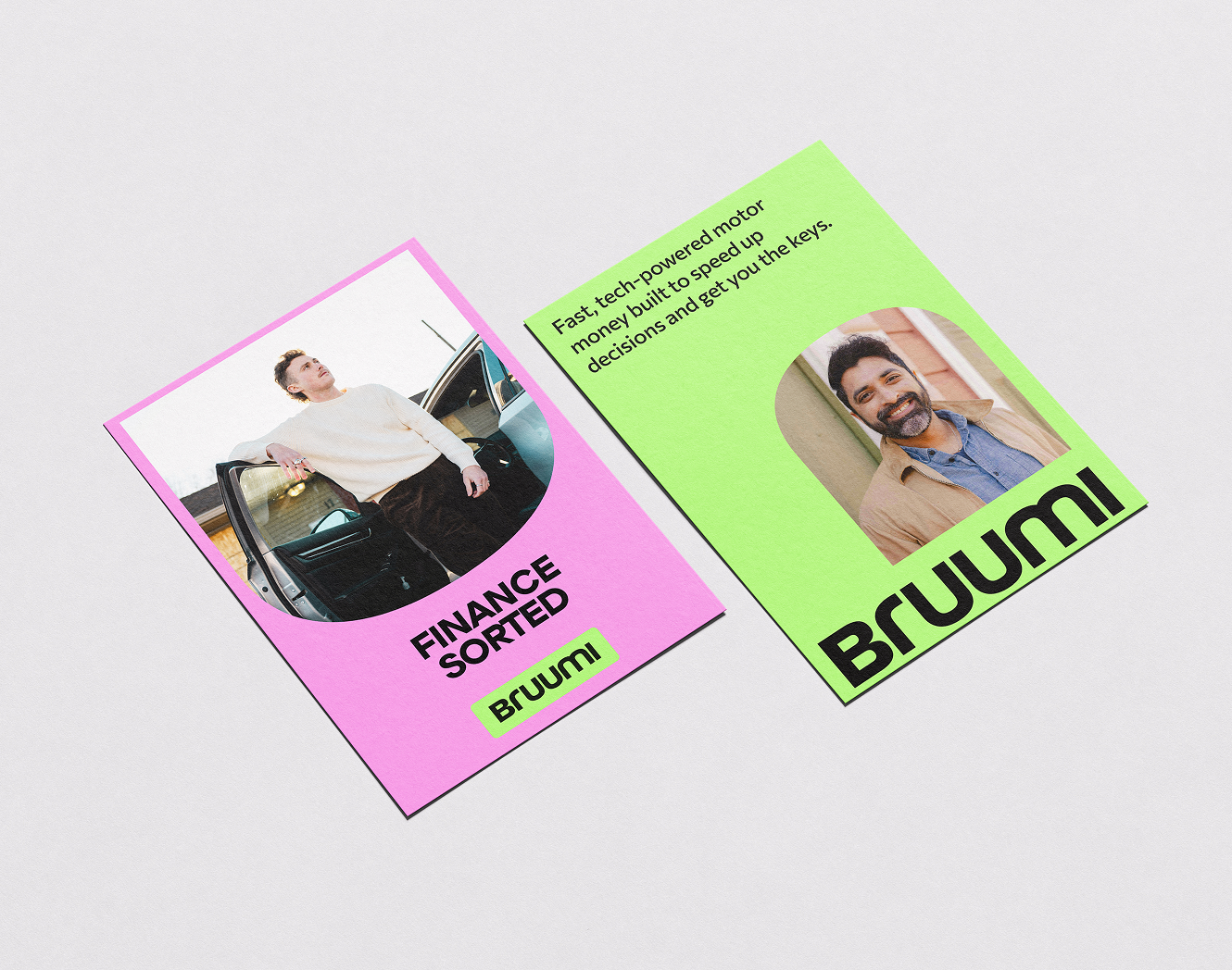
The colour palette breaks away from predictable corporate blues. Ignite Green brings energy, optimism and forward motion, while Pulse Pink adds warmth and personality. Instant Black and Pure White give the system confidence, clarity and structure. Together, the palette balances the credibility finance demands with the energy and personality of a challenger.
Brand world
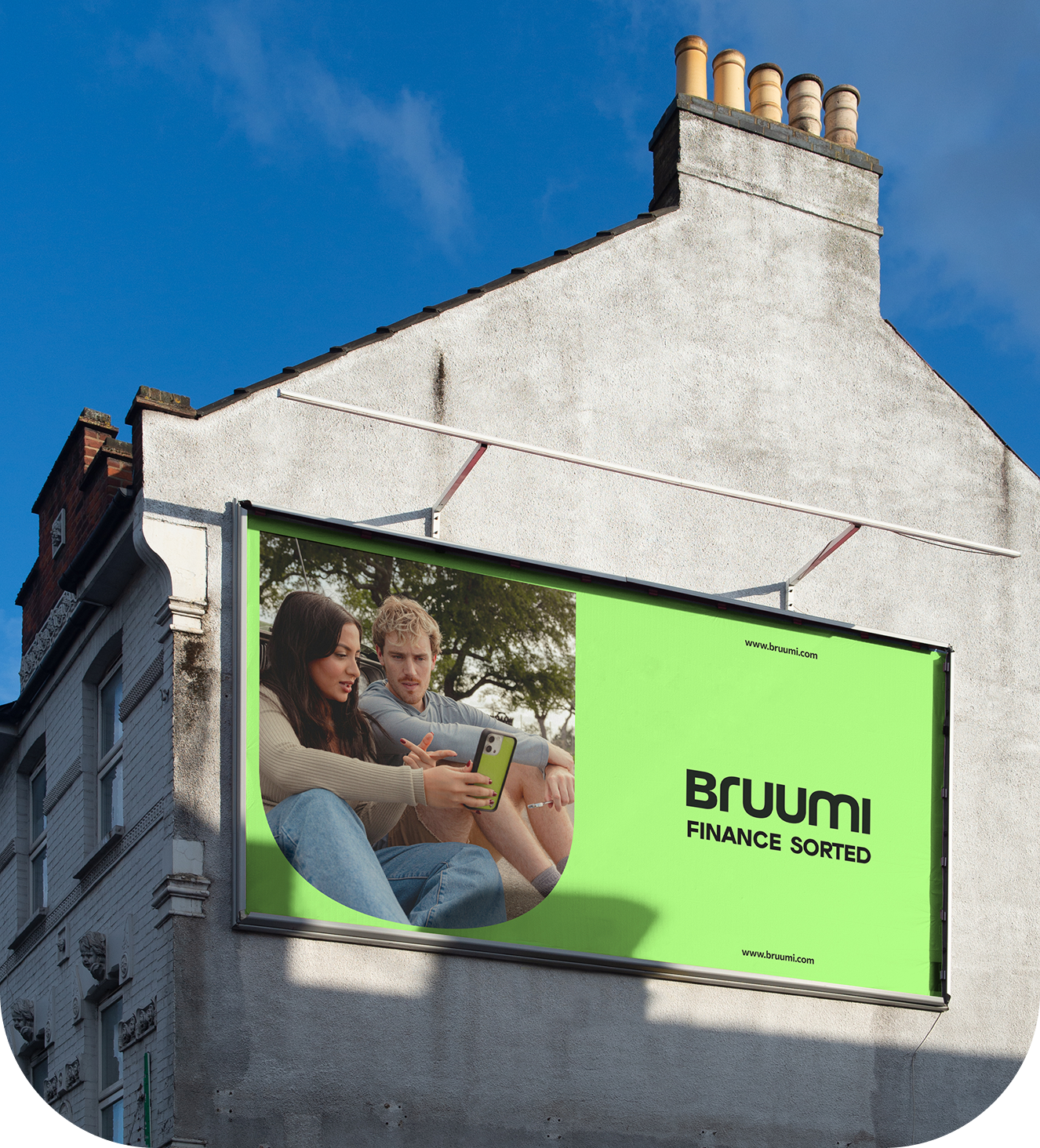
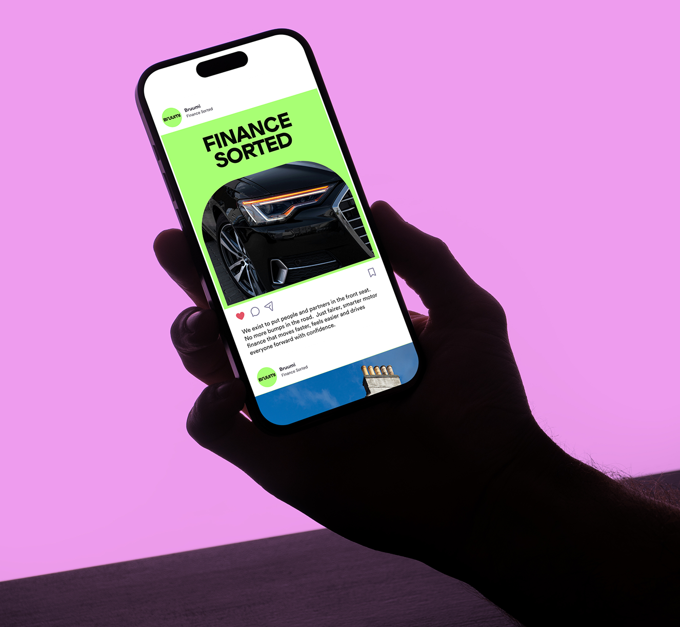
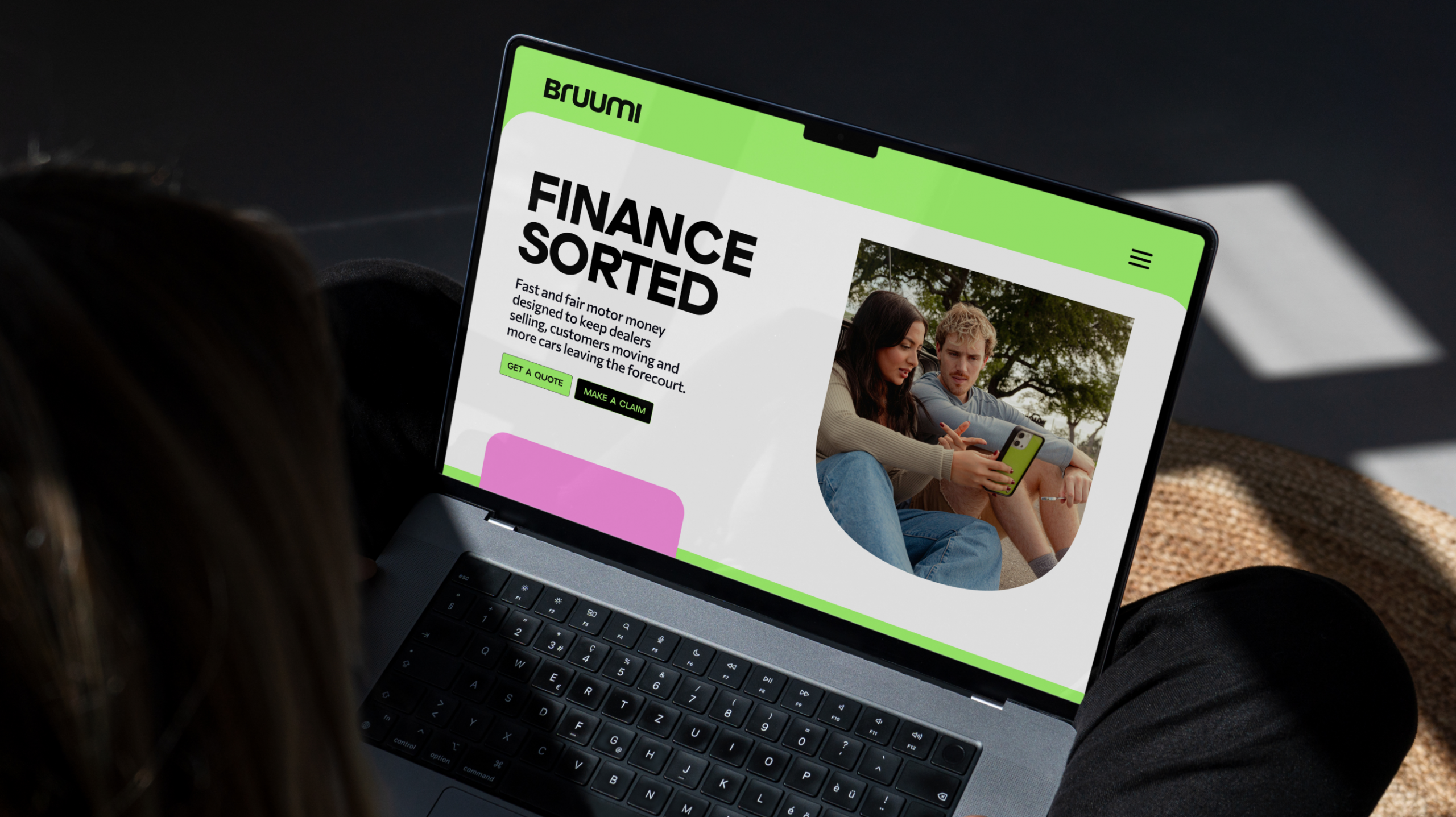
The wider brand world extends those ideas across every touchpoint. The U expands into rounded frames that hold colour, photography and messaging, giving the system a consistent sense of flow and a distinctive Bruumi character.
Photography keeps people at the centre, moving away from polished automotive clichés in favour of natural driver portraits and honest moments from inside the cabin.
A distinctive ripple treatment brings motion to still imagery, taking inspiration from the bends, turns and flow of the road. Radiating out from the subject, it makes progress feel visible, giving the brand a sense of confidence, optimism and forward motion.