Mallow & Marsh
Elevating a marshmallow brand into an indulgent foodie favourite.
Background
Mallow & Marsh is a beloved brand with widespread distribution and a loyal fanbase. After its acquisition by Serious Sweet Company, 2023 was a pivotal time to evolve the brand’s positioning, moving beyond its start-up roots to fully embrace its foodie credentials as the indulgent treat consumers already enjoy.


How we got there
We aimed to create a brand personality beyond just ‘marshmallow’. The previous positioning reinforced associations with basic toasting marshmallows. Mallow & Marsh offers a superior, indulgent treat and we needed it to have the right to show up in the chocolate aisle. The re-framed positioning, Pauseworthy Pleasure, shifted the tone to luxury and a foodie approach, speaking to a broader audience.
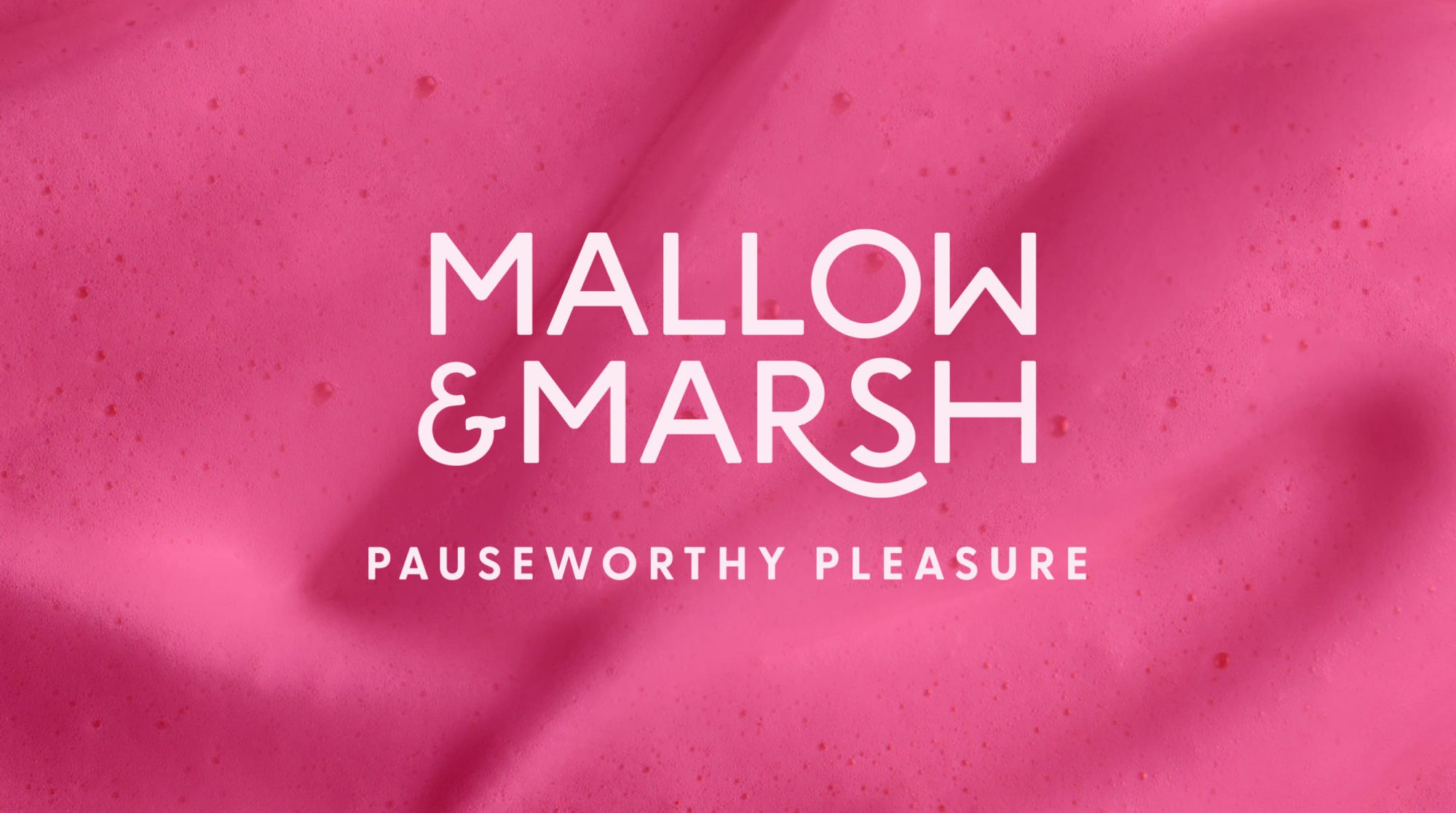
Defining our positioning
The brand guidelines centred on Pauseworthy Pleasure, whilst avoiding cliché ‘break time’ cues. Instead, it embraced a new form of me-time, inspired by modern self-care and meaningful living. This philosophy aimed to position Mallow & Marsh as an indulgence for moments that matter, not just casual snacking, where your free time is spent doing what you love.

Visual identity
The new visual identity focused on decluttering the brand. Cartoons and cutesy language were replaced by a confident, minimal approach. A condensed colour palette, led by the iconic pink, was combined with enticing food imagery and short, evocative copy to position Mallow & Marsh alongside iconic treats.
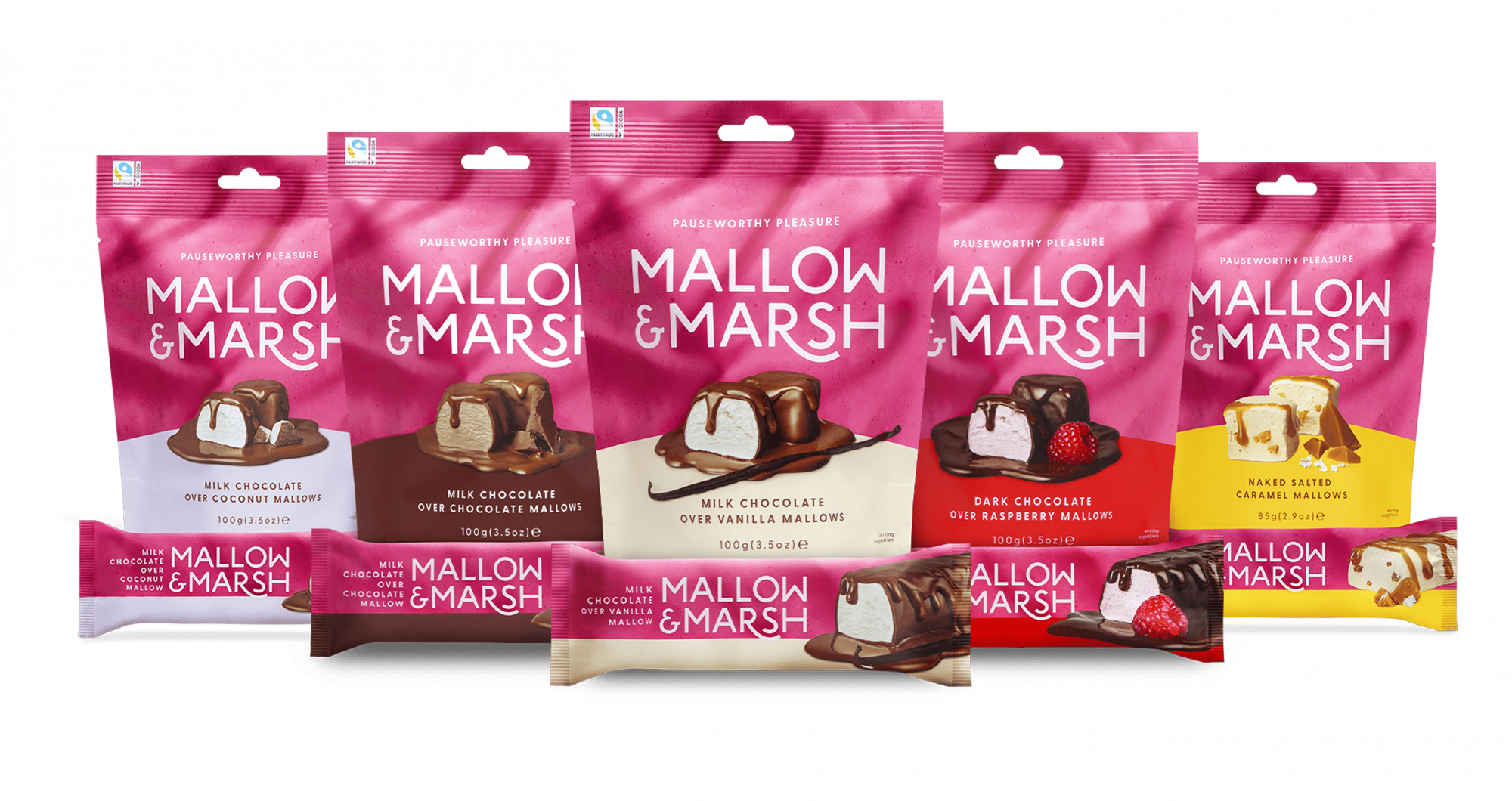
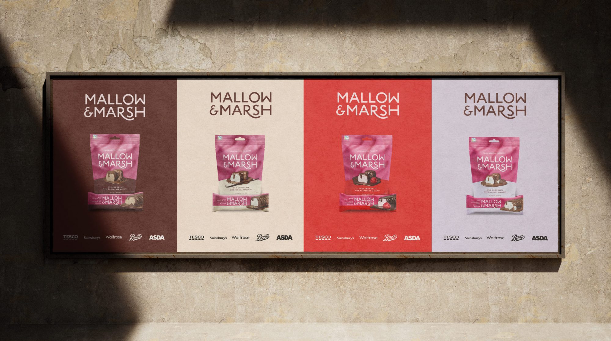
Packaging
We refreshed all packaging to align with the new positioning. For the first time, the entire brand embraced a unified pink colour, dripping-chocolate photography, and a unique textured background created from the brand’s own mallow texture, bringing the indulgence to life.


Social media
We ran both organic and paid social media for Mallow & Marsh across Instagram, Facebook, and TikTok. The focus was on highlighting the product and showcasing confident, characterful moments of Pauseworthy Pleasure, elevating the brand’s luxurious appeal across platforms.


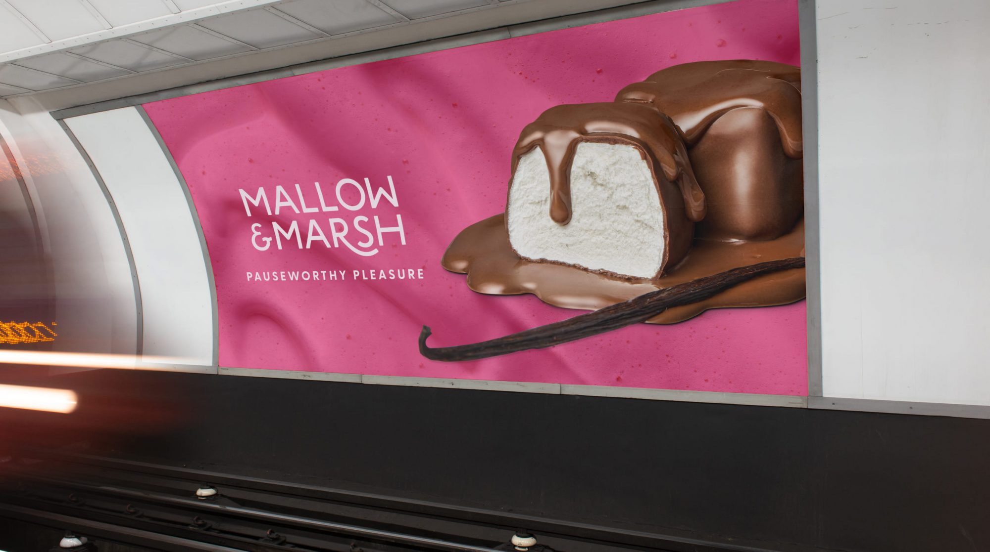
Above the line launch
In Spring 2024, the new brand launched with bold advertising across London, turning the city pink. The campaign, featuring OOH and paid social, focused on luxurious product imagery, standing out in a market filled with ‘chatty’ FMCG brands often relying on humour.

Digital touchpoints
We redesigned Mallow & Marsh’s Amazon storefront and website to create a seamless user experience. The new digital presence spotlights the brand’s iconic pink, indulgent texture, and crafted flavour, making the purchase process easy while showcasing the brand’s unique qualities.


'From the outset, we were impressed with Boldspace’s credentials in this sector and their ideas for Mallow & Marsh certainly did not disappoint. We are looking forward to working with the team to bring these to life, making Mallow & Marsh the category leader it deserves to be.'
Rob Whitehead
Managing Director